IMPERIAL MOTO
Packaging design
Illustration
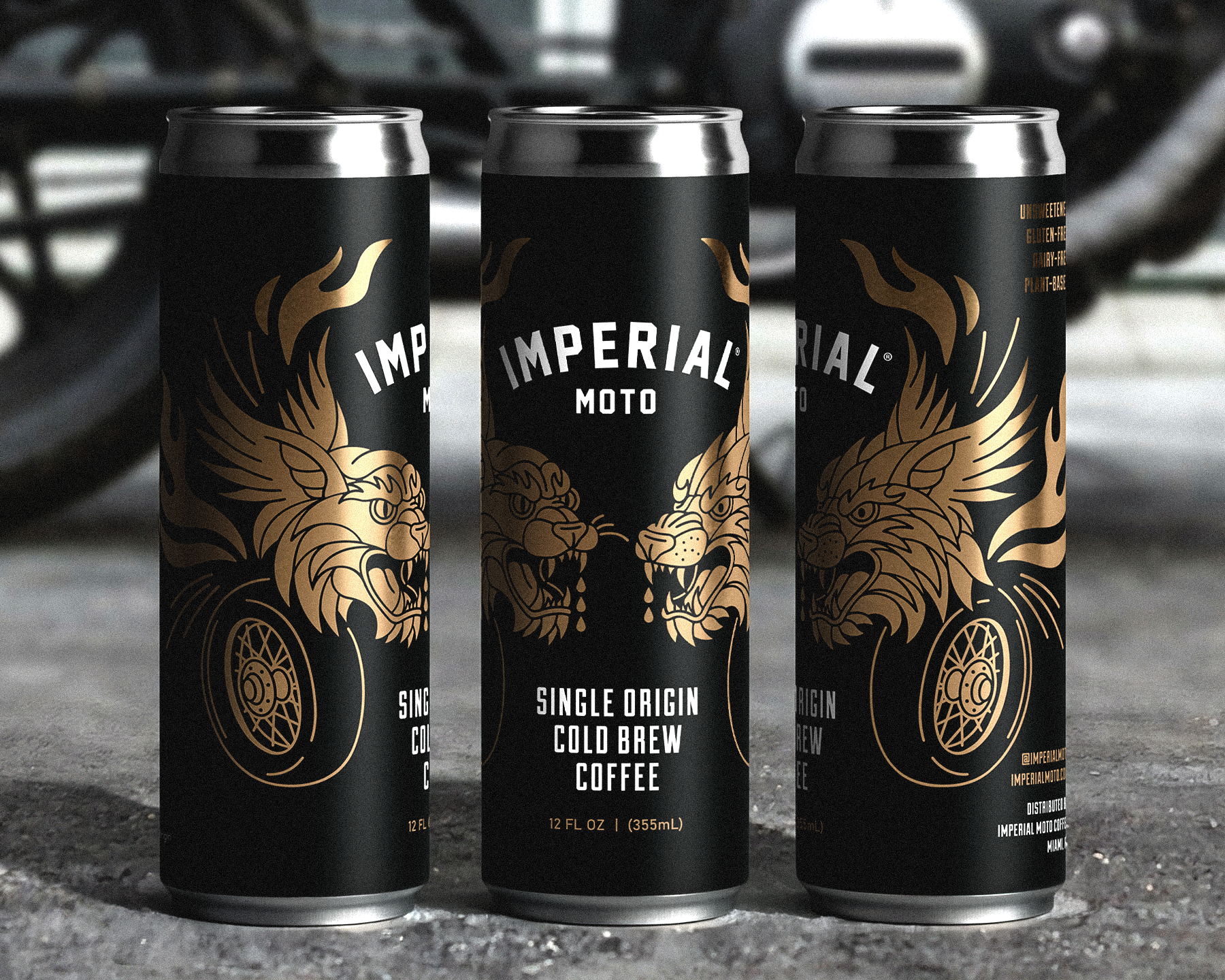
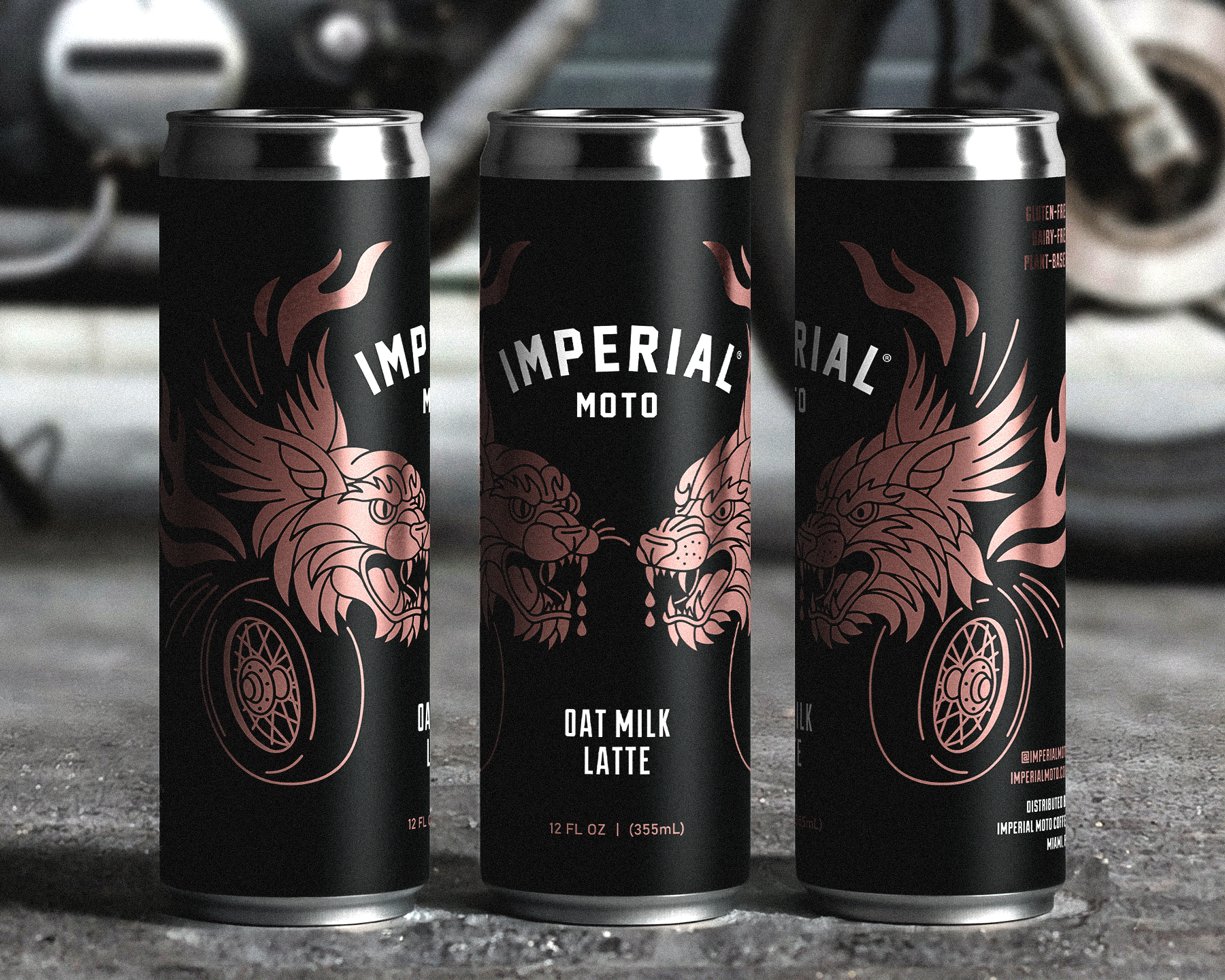
Imperial Moto is a Miami-based coffee shop built around moto culture, equal parts throttle and caffeine. For their canned coffee launch, the direction was simple: make it bad ass. So that's what I did. Two creatures, one feline, one canine, share the same dark, bold visual language across both SKUs. Same bones, different skin. Black with gold for the Single Origin Cold Brew. Black with rose for the Oat Milk Latte. The illustration wraps the can with enough edge to stop you cold and enough grit to earn a second look.