CHOP & HUE
Logo design
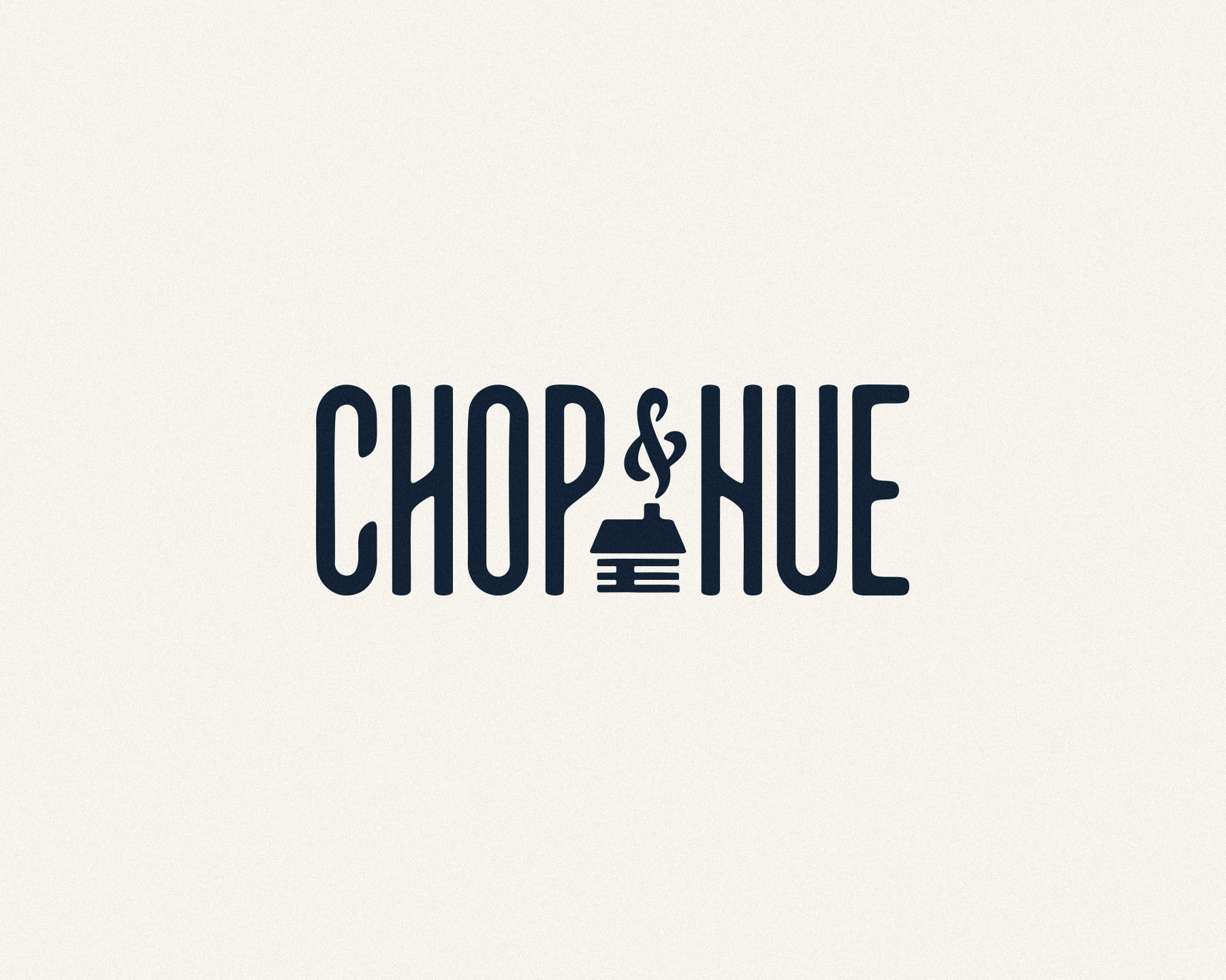
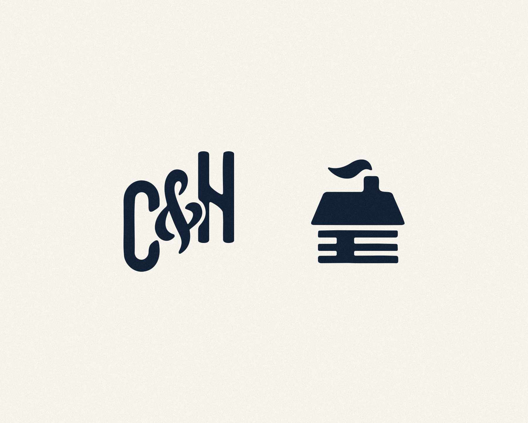
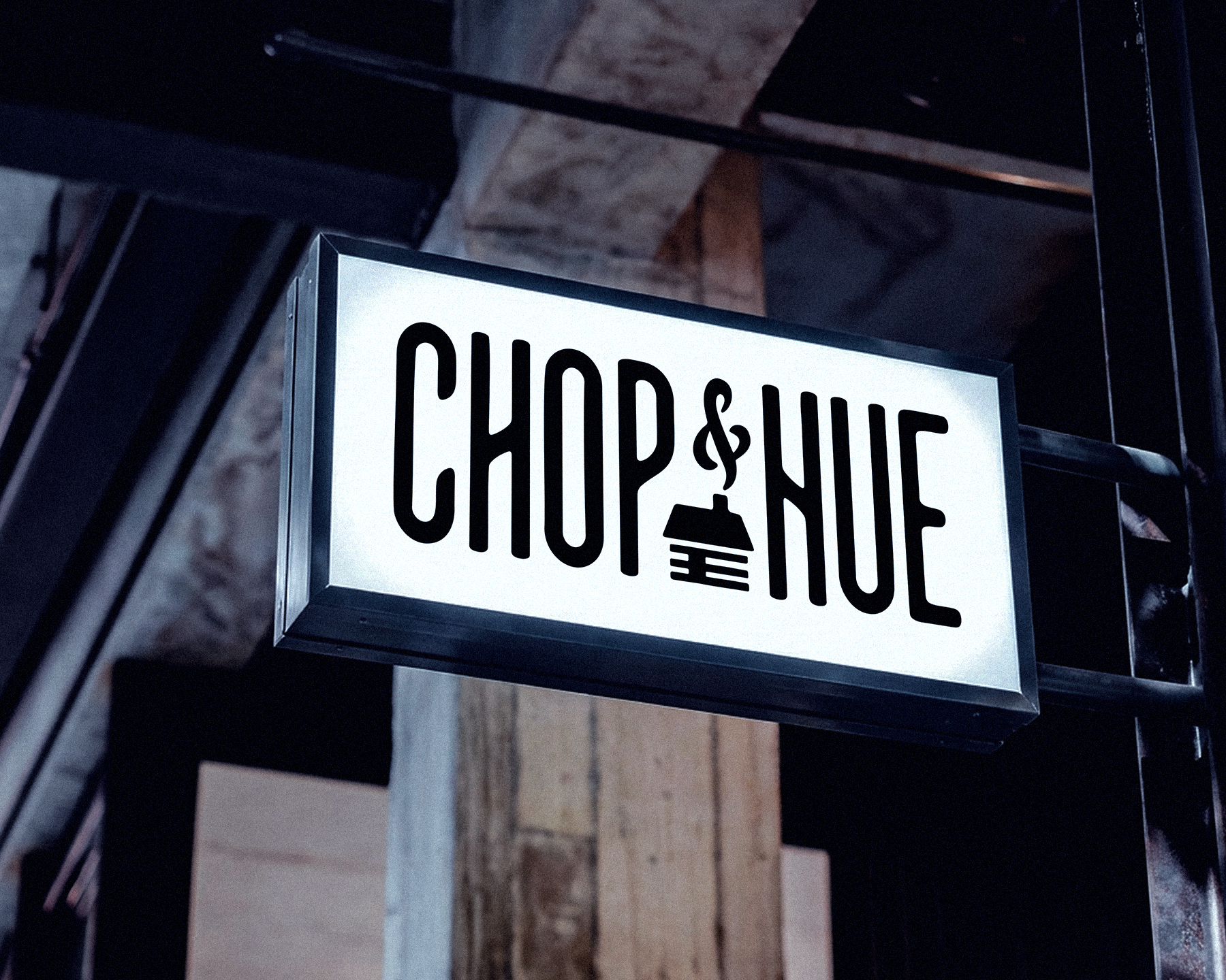
Chop & Hue is a video production studio run by friends and longtime collaborators I’ve looked up to for years. As they marked ten years, they decided it was time to update their logo and visual brand, so they called. The logo system centers on a cabin-and-ampersand that anchors the wordmark and gives the brand a sense of place. This thing was developed with close collaboration and mutual trust, built to work across motion, merch, signage, and digital applications. And we did it all in less than 20 rounds of feedback.

WORDS
When collaborating with Aaron, it shouldn’t be a surprise that he brings an unfussy clarity to his designs and a willingness to approach a logo project from both classic and unexpected directions. What I valued most of all was his confidence to push back, challenge, and advocate for decisions while backing it up with a persuasive foundation of design principles and intuitive good taste.
Now that is something that only comes from experience.
DAN WILTSHIRE
Co-owner
Chop & Hue
