OUR BREWING
COMPANY
Packaging Design
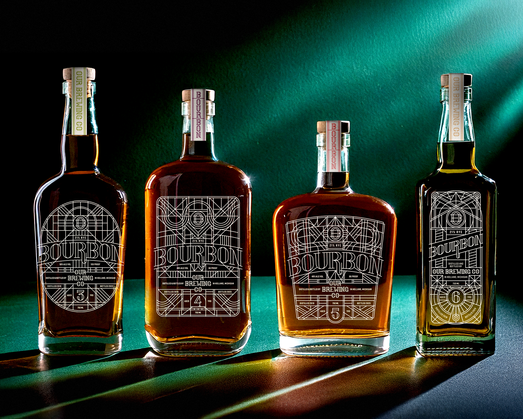
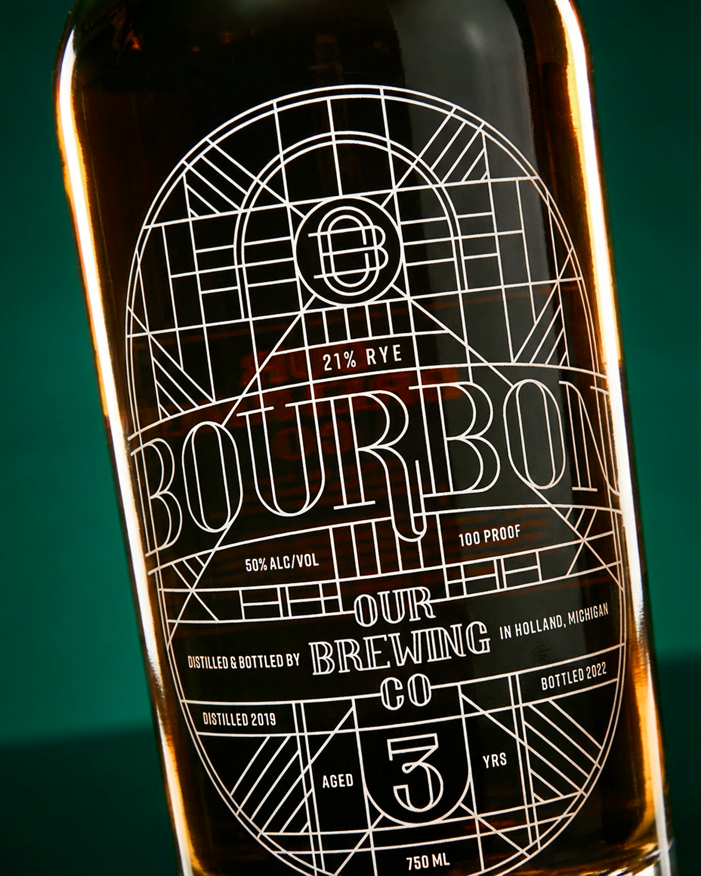
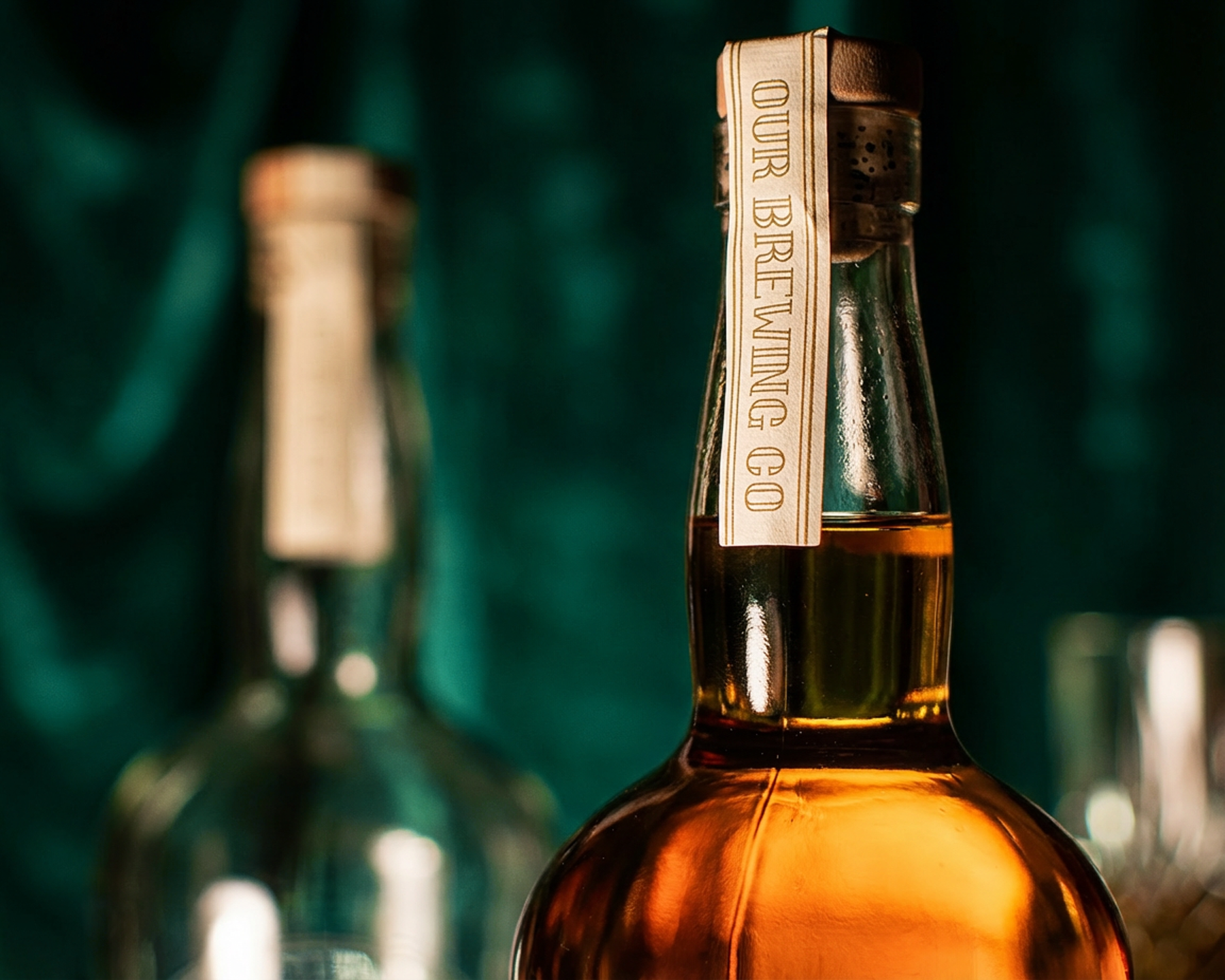
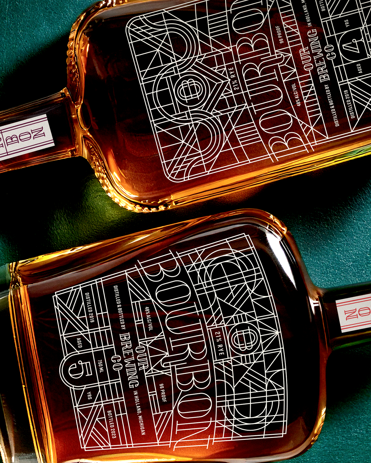
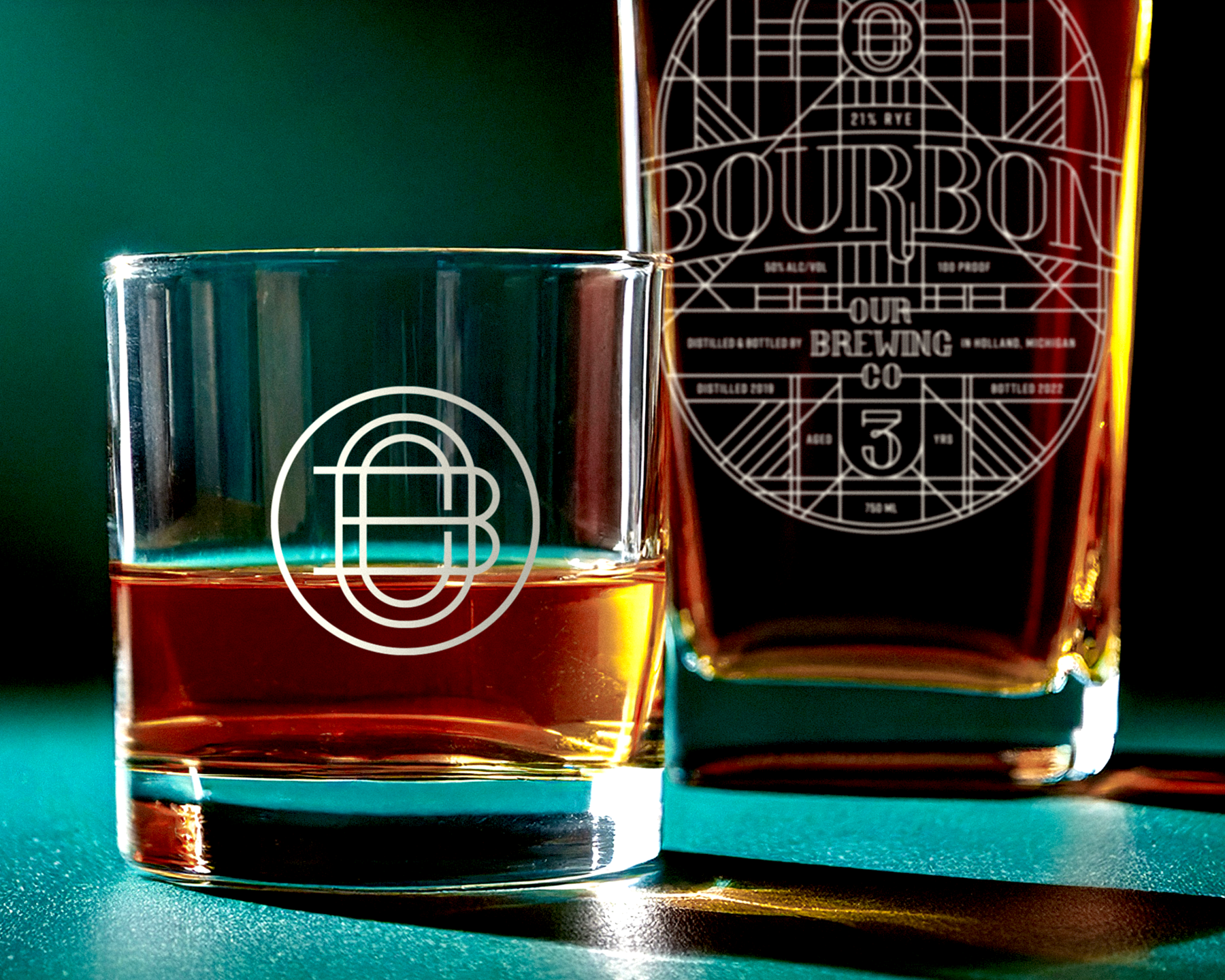
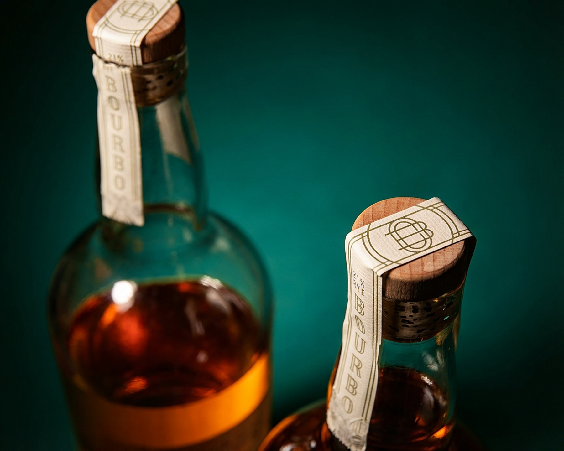
When Our Brewing Co. told me they’d been aging bourbon for the last three years and asked if I wanted to create the label, the only acceptable response was, “Hell yes, I do!” The vibe of the brewery has turned loungy, but it’s still punchy, and that’s what this design needed to be too. For anyone paying attention, the labels pull from art deco–inspired styling, with hidden imagery pointing to Masters of the Universe. There have been four releases so far, each one aged a year longer than the last. Bottles sell out day-of and there’s usually a line down the block, but check the taproom. They probably have some behind the bar for sipping.
WORDS
When it came time to bottle our first-ever batch of bourbon, the bottle and design had to be perfect and fit our vibe. Who else but the man who designed all of our anniversary artwork? As expected, he killed the designs.
TREVOR DOUBLESTEIN
Owner
Our Brewing Company
CREDIT
Joe Matteson, Photo